2/5 Katy M. 1 year ago on Google
TLDR:
After
exiting
this
experience,
some
people
sitting
outside
asked
us
if
they
should
go
try
this
event.
From
the
outside
and
the
marketing,
it
looks
like
a
glossy,
inviting
and
somewhat
mysterious
experience.
We
told
them
to
spend
their
money
elsewhere,
and
I
would
say
the
same
to
everyone
reading
this
review.
Artechouse
as
a
company
has
the
start
of
something
good
going
but
there
is
a
lot
of
work
to
be
done
before
it
really
delivers
on
the
intersection
of
art
and
technology
like
their
intro
video
promises.
Immersive
artwork
and
artwork
involving
data
are
both
two
exciting
emerging
mediums
which
I
believe
have
a
lot
of
potential
impact
in
the
future.
However,
the
actual
experience
itself
leaves
room
for
improvement.
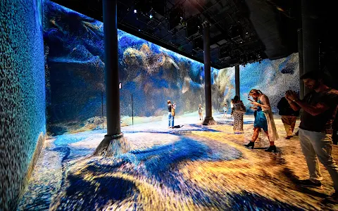
The
theme
of
the
multimedia
exhibit
is
"trust".
While
you
are
promised
"multiple
rooms"
of
interactive
immersive
data
as
art,
in
reality,
there
is
only
one
large
space
of
interest
with
3
walls
and
floors
being
covered
by
a
looping
projector
display
of
data
as
art.
While
this
is
a
cool
feat
in
itself,
the
exhibit
lacked
the
background
knowledge
and
context
which
was
needed
to
prepare
the
consumer
for
what
they
were
going
to
see.
The
exhibit
may
have
been
themed
as
trust,
but
it
was
hard
to
trust
that
the
art
we
were
seeing
was
not
just
randomly
generated
by
a
computer.
I
come
from
a
math
and
computer
science
background
--
so
if
someone
tells
me
that
I
am
going
to
see
artwork
produced
by
data,
I
want
to
understand
it
and
how
it
works.
At
best,
Artechouse
glosses
over
the
fine
details
of
how
the
artwork
is
actually
produced
and
what
data
and
correlations
it
is
using.
In
reality,
they
took
financial
data
and
also
social
data
which
contained
the
word
"trust"
and
tried
to
spin
that
into
a
correlation.
Not
only
is
that
a
little
skeptical,
but
once
you
actually
see
the
data
displayed
as
art,
the
brain
wants
to
make
connections.
Humans
are
constantly
looking
for
meaning
in
interpreting
their
surroundings.
But
with
so
little
context
as
to
what
the
data
being
displayed
was
and
also
when
the
data
was
from,
it
was
impossible
to
gain
anything
meaningful.
Yes
it
is
a
pretty
lights
display.
But
thats
about
it.
The
entire
experience
is
half
an
hour
of
you
sitting
on
a
hard
floor
staring
at
a
grainy
display
of
dots
pixelating
around
you
on
3
walls.
There
is
intense
thematic
music
playing
around
you
which
encourages
you
to
try
to
parse
out
something
life
changing
from
this
display.
The
first
few
minutes
are
cool,
but
then
you
realize
that
there
is
no
actual
discernible
story
from
the
ill
defined
images
cascading
on
the
screen.
It
kind
of
felt
like
we
were
watching
an
old
movie
where
the
directors
are
trying
to
make
it
look
like
cool
computing
is
going
on,
when
in
reality,
nothing
is
happening.
Overall,
a
huge
disappointment.
This
could
have
been
done
in
a
much
more
powerful
way
that
enabled
the
public
to
not
only
see
the
correlation
between
historical
events
and
social
sentiment,
but
also
learn
about
the
power
of
data
and
applications
of
data
analytics
using
computer
science.
1 person found this review helpful 👍