1/5 Beatrice L. 5 months ago on Google
Galaxy
Far
Away
Room:
We
have
done
over
40
rooms
all
across
Ontario:
Ottawa,
Windsor,
London,
Hamilton,
Oakville,
Burlington,
Milton,
Toronto.
This
was
the
absolute
worst
escape
room
we
have
ever
encountered.
It
wasn’t
1
thing
-
that
would
be
just
normal,
we
don’t
expect
perfection
-
it
was
everything.
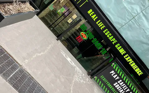
1.
The
room
is
right
at
the
entrance
to
the
facility.
There
is
no
sound
isolation
whatsoever,
you
can
hear
everything
happening
outside.
Immersion=0
2.
Ambiance:
it
was
insanely
hot
inside
the
small
space,
we
were
cooking.
3.
This
was
the
first
room
ever
where
we
were
told
we
are
not
allowed
to
take
a
water
bottle
inside.
That’s
insane.
Food
or
pop,
absolutely,
don’t
take
inside.
But
water?
4.
Whoever
designed
this
room
did
it
backwards
-
had
an
idea
that
sounded
good
to
them,
then
retrofit
some
items
in
the
room
to
make
them
“work”.
Newsflash
-
they
don’t.
It’s
not
that
the
puzzles
are
hard.
There
is
no
connection
between
the
puzzles
and
the
hints
provided
on
the
iPad.
0
logical
connection.
5.
Hints
-
and
clues.
Those
are
two
different
things.
The
room
is
supposed
to
contain
clues
which,
when
properly
deciphered,
lead
to
the
solution.
This
room
has
almost
no
clues.
The
iPad
they
give
you
-
again,
0
immersion
but
by
now
that’s
a
minor
detail
-
contains
what
can
be
charitably
called
clues.
That’s
not
how
escape
rooms
are
supposed
to
work.
6.
A
critical
piece
of
technology
does
not
work.
The
attendant
had
to
come
in
the
room
twice
to
make
it
work.
If
the
tech
does
not
work
as
intended
each
time,
then
it’s
out
of
place
or
defective.
Remove
or
redesign.
7.
Red
herrings
are
ok,
even
expected.
But
when
the
same
thing
is
a
design
/
red
herring
in
one
space
but
then
is
a
clue
(for
once
there
was
a
clue)
in
another,
that’s
poor
design.
Other
red
herrings
are
scattered
throughout
the
space
willy-nilly
that
you
never
need,
they’re
just
scattered
around
to
make
it
look
as
if
there’s
more
to
do
than
there
actually
is.
8.
A
small
number
of
total
puzzles
which
given
the
cost
is
really
overpriced,
but
I
guess
that’s
irrelevant;
since
none
of
them
make
sense,
you
will
get
nowhere
anyway
so
each
is
insanely
time
consuming.
9.
Items
that
are
part
of
the
room
structure:
in
over
40
rooms
we
have
always
respected
the
instruction
to
not
touch,
push,
climb,
twist
etc
any
part
of
the
actual
physical
structure
of
the
room.
Check.
As
expected,
we
were
told
before
starting
this
room
that
we
should
not
touch,
push
etc
anything
in
this
one,
also.
Of
course,
makes
sense.
Except
you
can’t
advance
from
the
first
space
unless
you
absolutely
break
this
rule
and
do
the
exact
opposite.
Again,
poor
design
and
poor
instructions.
Just
put
stickers
on
items
you
aren’t
supposed
to
touch
like
proper
rooms
do,
and
then
it
becomes
obvious
that
a
place
contains
a
puzzle
related
item
if
there’s
no
sticker.
This
is
just
logic…
10.
Whoever
designed
this
room
is
a
born
contrarian.
The
usual
process
is:
you
find
a
bunch
of
scattered
clues,
put
them
together,
they
lead
you
to
decipher
/
interpret
/open
a
lock
in
the
room.
This
designer
thought
it
would
be
amusing
to
give
pointers
the
opposite
way:
things
that
don’t
exist
are
the
clue
-
places,
numbers,
letters,
etc.
if
it
isn’t
there,
if
it
doesn’t
repeat,
if
there
is
no
pattern…
that
is
a
clue,
but
not
in
any
sort
of
logical
way.
Seriously
hope
they
consider
another
career
in
the
future.
11.
The
last
clue
to
solve
the
room
and
get
out
was
more
of
the
above.
Absolute
sheer
silliness
-
we
could
not
believe
it.
When
you
manage
to
process
a
bunch
of
info
from
a
screen
flashing
every
20
sec
so
you
just
wasted
time
waiting
to
read
/
take
notes
of
all
the
content,
you
finally
accumulate
a
bunch
of
clues
to
lead
to
X
and
you’re
stumped.
Fair
enough,
sometimes
you
run
into
something
you
can’t
figure
out,
so
you
ask
the
attendant
for
a
hint
and
she
says,
well
you
actually
need
to
use
the
clues
to
eliminate
the
logical
response
and
see
what
you
are
left
with?
Wow.
Just…
no.
So,
although
there
may
be
another
room
at
this
location
which
is
good,
we’ll
never
waste
$120
for
3
people
to
find
out.